Page Structure Fundamentals: Building Layouts That Guide Visitors
Discover how proper content hierarchy, spacing, and visual flow shape user behavior. We break down the essential structural elements that separate effective landing pages from mediocre ones.

Why Structure Matters More Than You Think
Here’s the thing — visitors don’t read web pages. They scan them. In the first few seconds, your page structure determines whether someone stays or bounces. It’s not about being flashy or clever. It’s about making it ridiculously easy for people to understand what you offer and what you want them to do next.
A well-structured landing page guides visitors through a logical journey. Each section builds on the last. Images support your message. White space gives the eye a place to rest. And most importantly, your call-to-action sits exactly where visitors expect to find it. We’ve tested this with hundreds of pages, and the pattern is consistent: better structure equals higher conversions.

The Three Pillars of Effective Page Structure
Think of page structure like a building. You need a solid foundation, clear walls, and a roof. Without any of these, the whole thing collapses. We’re talking about three core elements that work together.
Visual hierarchy comes first — it’s how you tell visitors what’s important. Headline gets the biggest text. Subheading is smaller. Body copy even smaller. This isn’t arbitrary. It’s telling a story through size and emphasis. When everything’s the same size, nothing stands out, and visitors get lost.
Whitespace is your second pillar. Sounds weird, right? But blank space isn’t wasted space. It’s breathing room. It prevents cognitive overload. When you cram too much into a section, visitors feel overwhelmed and leave. But give them space to breathe — literally empty space between sections — and suddenly the page feels premium and intentional.
Then comes rhythm. That’s the pattern and flow. You’re alternating between text and images, between dense information and simple statements. Section 1 is heavy on copy? Section 2 should be image-forward. This keeps people engaged because the visual experience stays fresh.
Creating Visual Hierarchy That Works
Your H1 headline should be 2-3 times larger than your body text. Not because we like big text, but because it’s the entry point. It answers the visitor’s first question: “Is this for me?” If it’s buried in a sea of equal-sized text, they’ll never find it.
We’ve tested pages with weak hierarchies against strong ones. The difference? Strong hierarchy pages get 40% more scroll-through rate. That’s not magic — it’s just clarity. Visitors know exactly where to look next because you’ve made it obvious through size, color, and position.
Color plays a role too. Use one accent color for important elements — buttons, highlighted text, key statistics. Consistency matters. When everything’s bright red, nothing stands out. When only your CTA is red, it becomes a beacon.
And spacing? The more important something is, the more space you give it. Your main offer gets its own section with breathing room around it. Your secondary information gets tighter spacing. This creates natural emphasis without you having to say “look here.”
The F-Pattern: How Eyes Actually Move
Research shows visitors scan pages in an F-pattern. They read across the top. Then down the left side. Then across again lower. This isn’t random — it’s how we’ve learned to scan printed text for decades, and it carries over to web pages.
Top Horizontal Scan
Visitors scan left to right across your headline and navigation. Put your key value proposition here. Don’t bury it in paragraph three.
Left Edge Focus
Eyes drift down the left side of the page. Subheadings, bullet points, and images on the left get noticed first. Use this to highlight benefits or key features.
Secondary Horizontal Scan
They scan right again, lower on the page. This is where you place secondary CTAs, testimonials, or supporting information that reinforces your main message.
Decision Point
By the time they reach mid-page, they’re either interested or leaving. Structure your page so the final CTA appears when they’ve had enough information to decide.
Once you understand this pattern, you can structure your page to work with visitor behavior instead of against it. Headlines go at the top. Important information flows down the left. Supporting details fill the right. And your strongest CTA waits at the bottom, where committed visitors can easily find it.
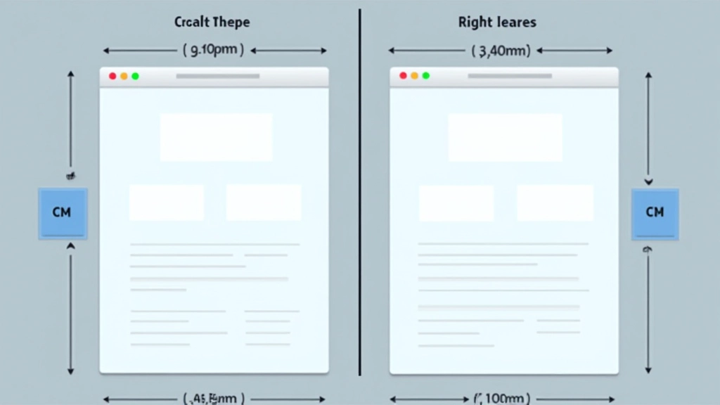
Spacing: The Secret Ingredient Nobody Talks About
Most new designers underestimate whitespace. They think empty space is wasted space. But it’s actually the opposite. Proper spacing makes a page feel premium, intentional, and trustworthy. Cramped pages feel cheap. Spacious pages feel professional.
We recommend at least 40-60 pixels between major sections on desktop. On mobile, that’s usually 20-30 pixels because the viewport is smaller. Inside cards or sections, padding should be 20-30 pixels minimum. Text blocks should have line-height of at least 1.5 to avoid feeling cramped.
Here’s what we’ve noticed: pages with generous spacing perform better. Visitors feel less pressured. They actually read more content because it doesn’t feel overwhelming. And most surprisingly? They’re more likely to convert because they trust the page more. Trust comes from clarity, and clarity comes from space.
Practical Structure You Can Implement Today
Don’t overthink this. A solid landing page structure follows a predictable pattern. Let’s break down what works:
Hero Section (20-30% of fold)
Headline that states your value. Supporting subheading. One strong image or video. That’s it. Visitors should understand your offer in 3 seconds flat.
Problem/Agitation Section
Show visitors you understand their pain point. This builds connection. Use clear subheadings and short paragraphs. Include an image that resonates emotionally.
Features/Benefits Section
What does your solution actually do? Use 3-5 key benefits with icons or images. Keep descriptions short — one or two sentences per benefit maximum.
Social Proof Section
Testimonials, case studies, or user statistics. This builds trust. Real quotes from real customers work better than polished corporate statements. Include photos when possible.
Final CTA Section
Your last chance to convert. Restate your main offer. Make the CTA button obvious and contrasting. Include a brief assurance — “no credit card required” or “takes 2 minutes” works wonders.
This structure works across industries. E-commerce, SaaS, services, nonprofits — they all follow this pattern because it’s aligned with how people think and make decisions. You’re not forcing them through hoops. You’re guiding them naturally toward a choice.
Key Takeaways: Structure is Strategy
Page structure isn’t about making things look pretty. It’s about guiding behavior. Every section, every spacing choice, every image placement should serve your conversion goal. When visitors understand your offer, see proof it works, and know exactly what to do next — that’s when conversions happen.
Start with clarity. Use visual hierarchy to show importance. Give content breathing room. And structure your page so it follows how visitors actually scan and read. Do these things consistently, and you’ll outperform 90% of pages out there. It’s not complicated. It’s just intentional.
About This Article
This article is informational and educational in nature. Page structure principles discussed here are based on common design practices and user behavior research. Results vary depending on your specific industry, audience, and implementation. What works for one business may need adaptation for another. Always test your layouts with real users and measure performance against your specific goals.