
Page Structure Fundamentals: Building Layouts That Guide Visitors
Discover how proper content hierarchy, spacing, and visual flow shape user behavior and guide visitors toward conversion actions.
Read ArticleStrategic CTA placement increases conversions significantly. Learn button positioning, color psychology, and copywriting techniques that make visitors actually click.
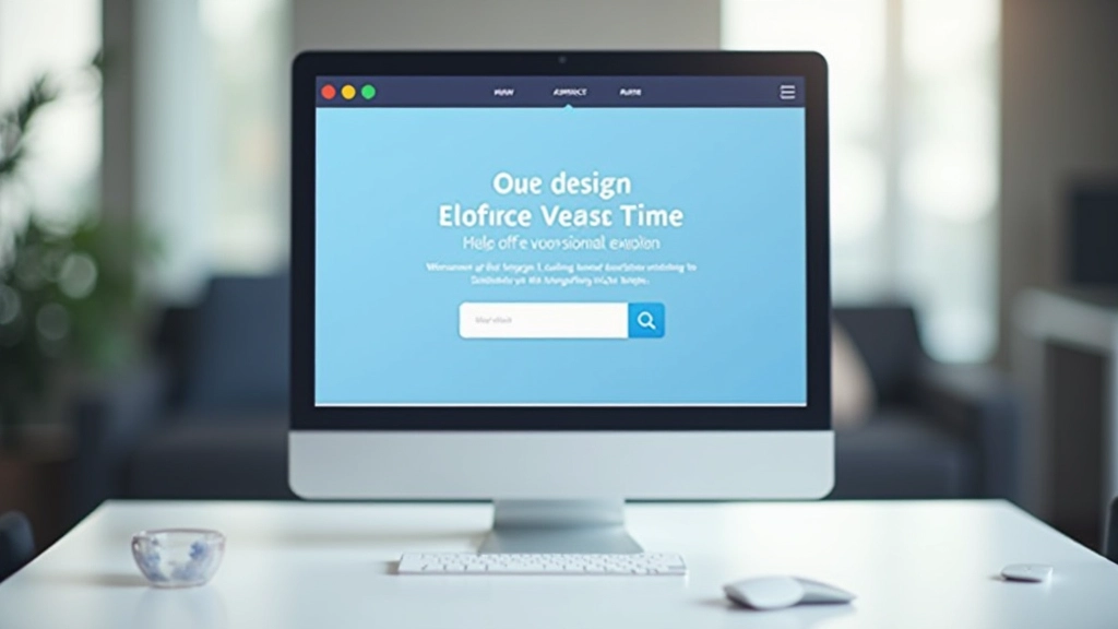
You’ve got compelling copy. Your product solves a real problem. The design looks professional. But then visitors leave without taking action. The culprit? Often it’s where you’ve placed your call-to-action button.
CTA placement isn’t about following design trends or what looks balanced on a webpage. It’s about understanding where your visitors naturally look, what catches their attention, and when they’re actually ready to convert. We’re talking about real conversion data here — buttons placed above the fold perform differently than buttons hidden further down. Button color, size, and surrounding whitespace all influence click-through rates.
The difference between a 2% conversion rate and a 5% conversion rate often comes down to these tactical details. You’ll learn the proven strategies that work, why they work, and how to test different approaches on your own landing pages.

Most visitors don’t scroll. They land on your page, scan quickly, and decide in seconds whether to stay or bounce. That’s why your primary call-to-action needs to live above the fold — the content visible without scrolling.
Studies show that CTAs placed at the top of the page get 3-4 times more clicks than those buried below other content. But here’s the key: placement alone isn’t enough. The CTA needs breathing room. Surround it with whitespace so it stands out. When a button is crammed between paragraphs and images, it becomes invisible even if visitors look directly at it.


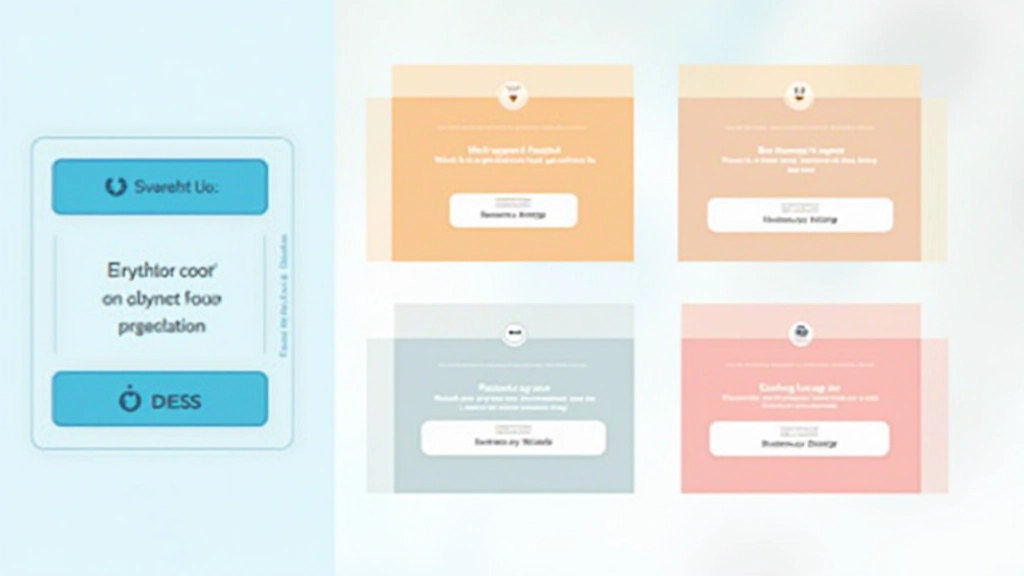
Not everyone converts on the first CTA. Some visitors need more information. They’ll scroll down, read your benefits, check testimonials, and then decide. That’s where secondary CTAs come in. You’re not being pushy — you’re giving them an exit ramp at natural stopping points.
Place secondary CTAs after major content blocks. After your features section, add a button. After social proof or testimonials, another one. After you’ve explained your pricing or guarantee, one more. Each CTA should feel earned — it comes after providing value, not before.
The magic number seems to be 3-4 CTAs per landing page. Fewer and you’re leaving conversions on the table. More and visitors feel pressured. Test within that range and watch your conversion data.
Your button color matters more than most people think. You’re not trying to match your brand color perfectly — you’re trying to make the button stand out from everything else on the page. The highest-performing buttons typically use colors that create strong contrast with the background.
Orange buttons work well on light backgrounds. Dark blue buttons pop on white. The psychological trigger is simple: when your button looks different from every other element on the page, the brain registers it as important. It’s worth clicking.
Text matters too. “Click here” gets ignored. “Get started,” “see pricing,” or “claim your free trial” creates action. The button text should tell visitors what they’ll get, not what they’ll do. “Download our guide” beats “submit” every single time.
“A well-placed, high-contrast button with clear action text can increase conversions by 45% compared to a generic ‘submit’ button in low contrast colors.”
— Conversion Optimization Research, 2025
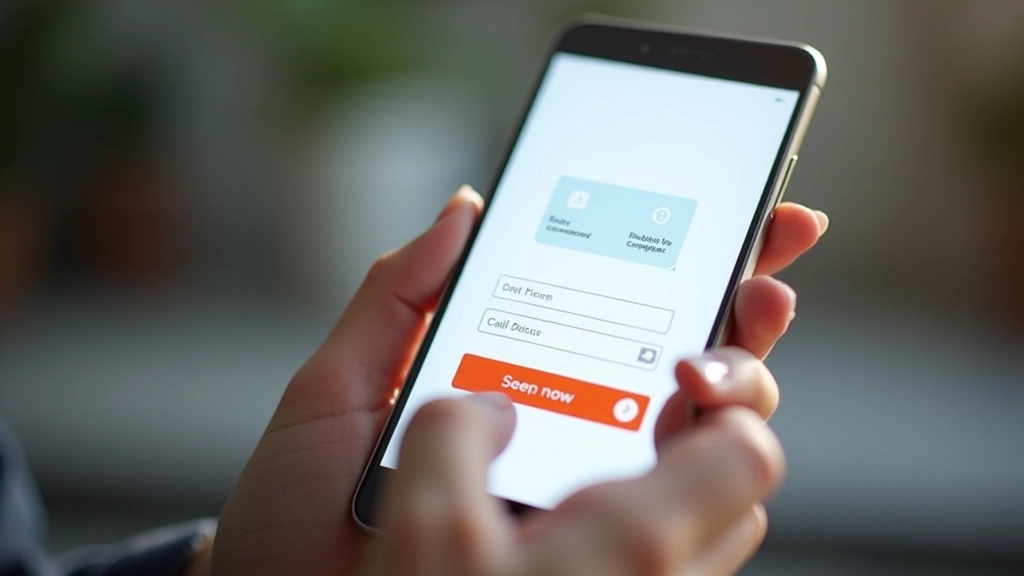
Over 60% of traffic comes from mobile devices. Desktop CTA rules don’t apply here. Your button needs to be thumb-friendly. That means at least 44×44 pixels minimum — better yet, 48×48 or larger. Visitors will tap your button with their thumb, often one-handed. If the target is too small, they’ll miss and get frustrated.
Vertical stacking becomes crucial on mobile. Put your primary CTA near the top. When content is narrow, a button that spans most of the width feels more clickable than a skinny button on the side. Don’t try to fit two buttons side-by-side on mobile — they’ll both feel cramped.
Spacing matters even more on small screens. A button crammed between text feels stuck. Add breathing room. Test your landing page on actual phones, not just browser simulations. Feel how the button clicks, whether it’s actually in a convenient thumb-reach zone. You’ll learn things the simulator never shows.
Every landing page is different. Your audience has different behaviors. Your product has unique selling points. Generic advice about CTA placement gets you maybe 70% of the way there. The remaining 30% comes from testing on your actual visitors.
Run A/B tests on button placement. Try the CTA above the fold versus 500 pixels down. Test button colors — your brand blue against a high-contrast orange. Change button text from “Learn more” to “See pricing” to “Start my free trial.” Small changes sometimes produce surprising results. A button moved 200 pixels higher might increase conversions by 12%. Different button text might boost it by 8%.
Give each test at least 100-200 conversions minimum before declaring a winner. One test might show orange buttons winning, but that’s only valid for your specific landing page, audience, and product. What works for a SaaS tool might not work for an e-commerce store. What converts design agency clients might completely fail with retail customers.

CTA placement isn’t a set-it-and-forget-it decision. It’s a core element of your landing page strategy. You’ve learned that primary CTAs belong above the fold with plenty of whitespace. Secondary CTAs should appear after you’ve delivered value. Button color needs to contrast strongly with your background. Mobile optimization requires bigger buttons and more vertical space. And testing reveals what actually works for your specific audience.
Start with these principles on your next landing page. Measure your baseline conversion rate. Then run tests. Change one element at a time — button placement, color, or text — and measure again. Track what moves the needle. After 4-5 weeks of testing, you’ll have a custom-optimized CTA strategy built on real data from your visitors, not generic advice.
The best performing landing pages we’ve seen treat CTA placement as a science, not an afterthought. They test constantly. They measure everything. And they’re not afraid to move a button that’s been in the same place for months if the data suggests a better spot. That’s how you go from average conversions to exceptional ones.
Explore More Landing Page StrategiesThis article provides educational information about call-to-action placement strategies and landing page design principles. The techniques and recommendations presented are based on general best practices and research trends in digital marketing and conversion optimization. Results vary significantly based on your specific audience, industry, product, and implementation. These are guidelines, not guarantees. Your actual conversion rates depend on many factors including traffic quality, offer relevance, copy effectiveness, and audience targeting. We recommend testing all recommendations on your own landing pages before full implementation. Consult with conversion optimization professionals for personalized strategies tailored to your business needs.
Discover how proper content hierarchy, spacing, and visual flow shape user behavior and guide visitors toward conversion actions.
Read Article
Images, color, typography, and whitespace work together to tell your brand story and create emotional connections with visitors.
Read Article
Data-driven design means testing different layouts, measuring results, and iterating based on what your visitors actually do.
Read Article